
From August to December 2022, I had the privilege to be attached to KPMG Singapore on a rewarding internship, where I had the invaluable opportunity to experience the work of an User Interface (UI) and User Experience (UX) designer.
I employed my proficiency with the Figma software to develop a design system required for the UI of multiple tax applications across the company’s intranet, as well as craft several mock-up wireframes and high-fidelity prototypes to illustrate the user flows conveyed in user stories written by product owners.
The following is a selection of UI components from the design system which depict the work done during my 16-week-long internship.
What is a Design System?
The design system can be likened to a library of User Interface (UI) components provided to developers to incorporate in webpages. Typically, design systems consist of typography, icons, buttons, forms and many other components that are designed by UI designers, whereby the colour specifications, text fonts and alignments are defined to ensure uniformity across webpages. These components are assets that are available for plug and play when designing mock-up wireframes or high-fidelity prototypes.
Buttons
Switches
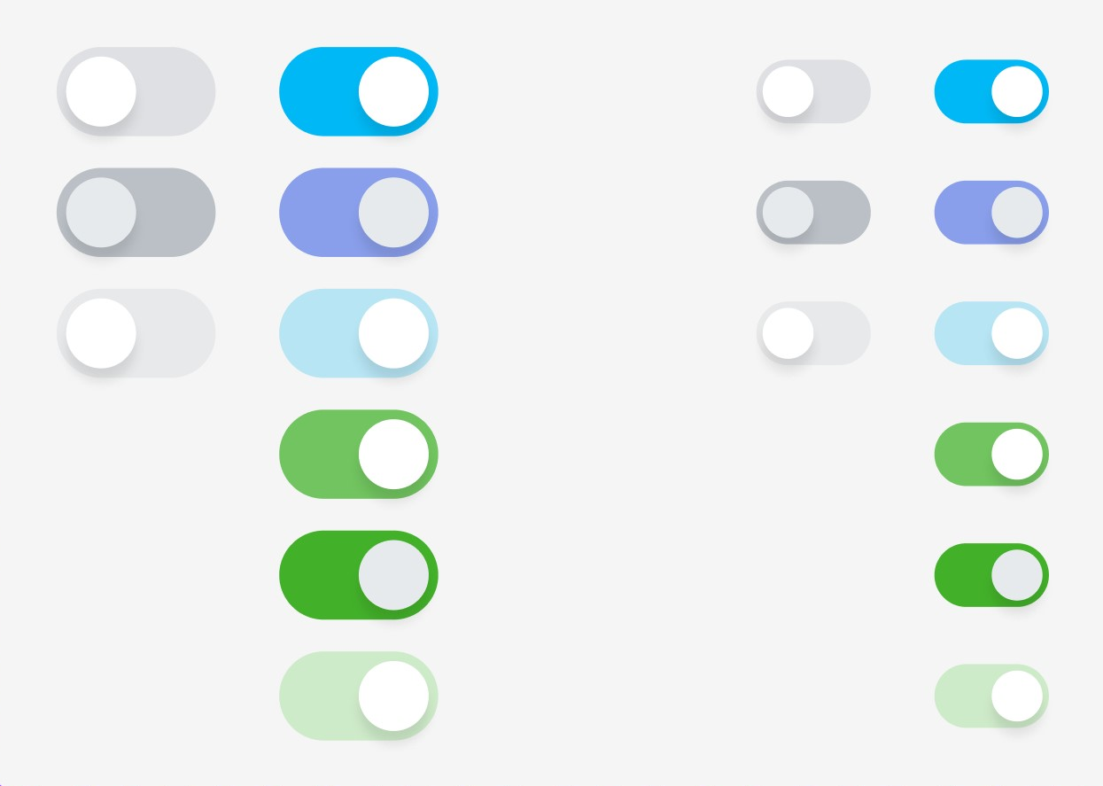
Switch component variants
Tooltip

Tooltip Helper Text component variants
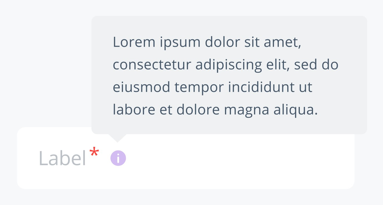
Tooltip Helper Text example
Forms
Form
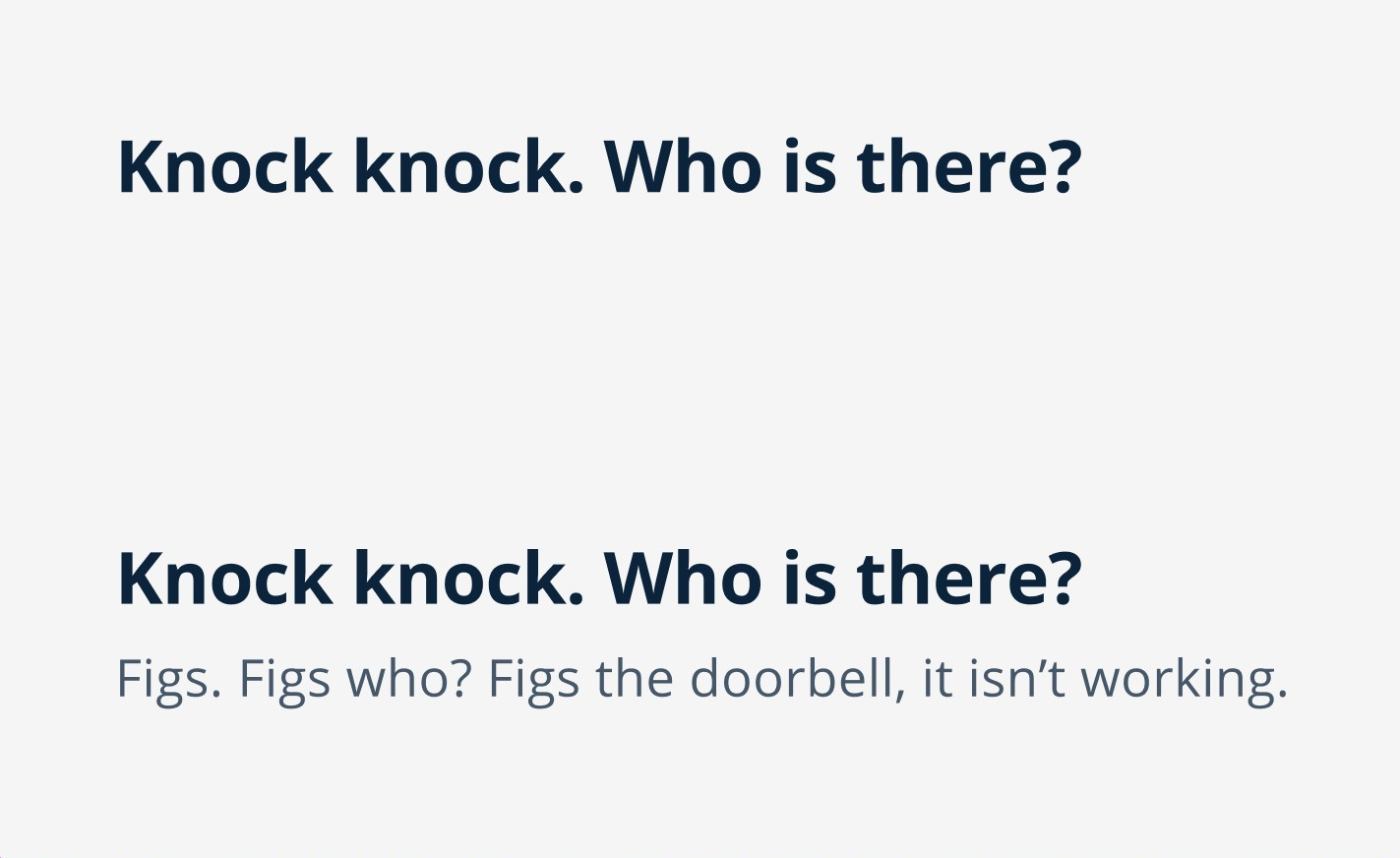
Form Question Text component variants
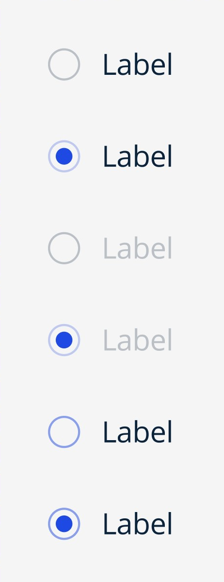
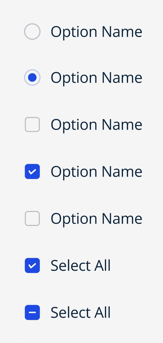
Radio Button component variants
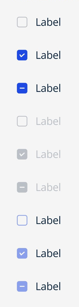
Checkbox component variants
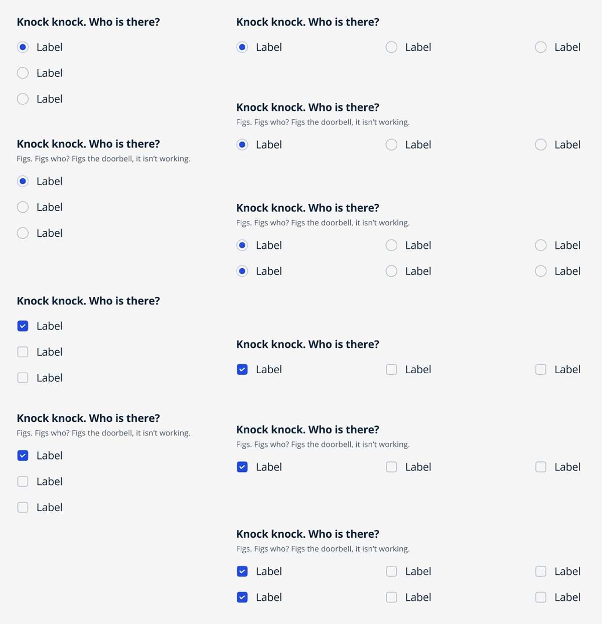
Form Question examples
Dropdown
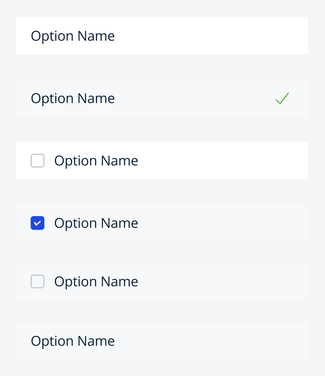
Dropdown List Options component variants
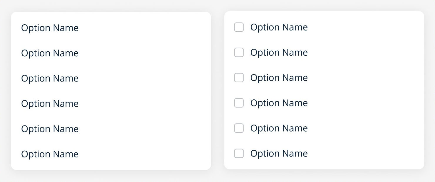
Dropdown List component variants
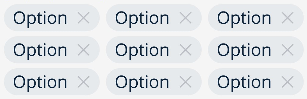
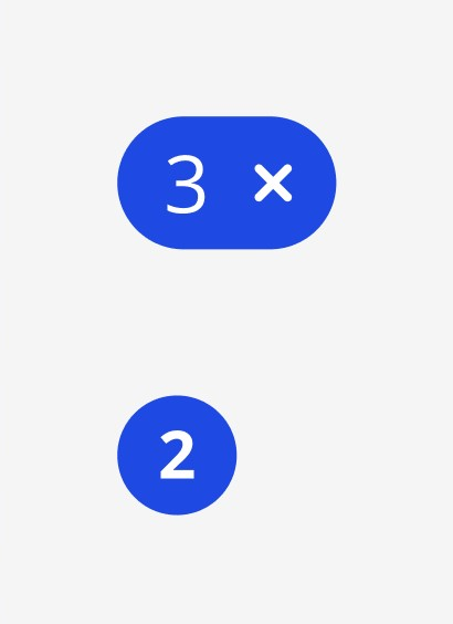
Dropdown Tag component
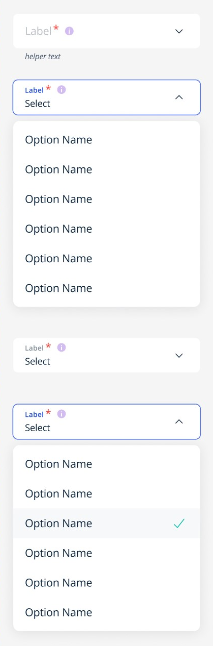
Simple Dropdown example
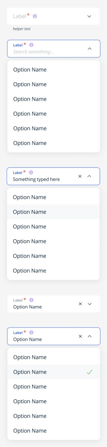
Combo Box Dropdown example
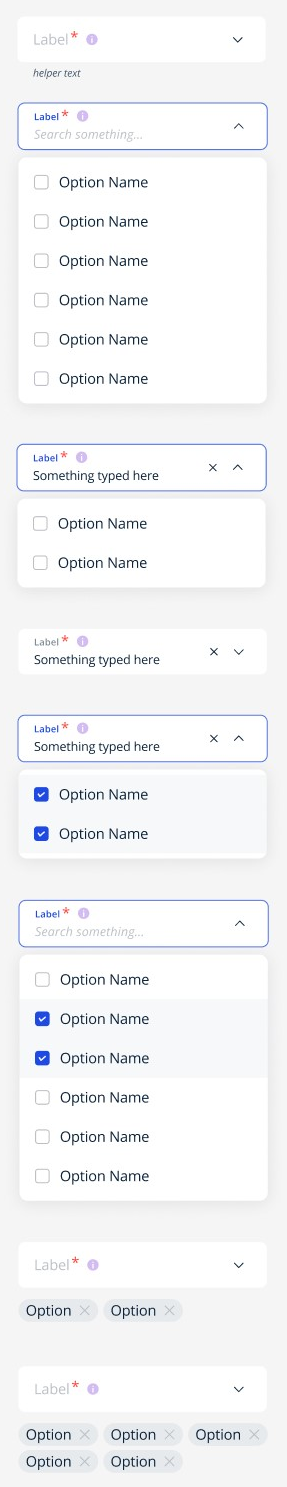
Multiselect Dropdown example
Calendar Picker
Date Text component variants
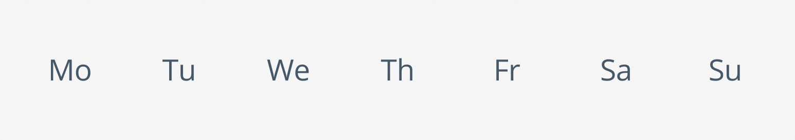
Day Text component variants
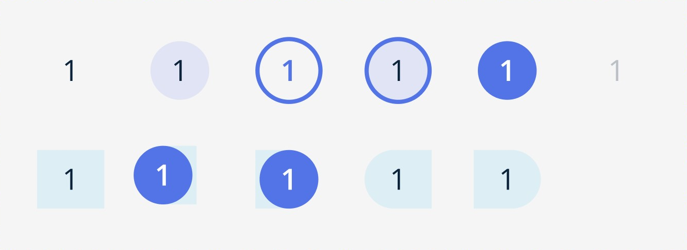
Year Text component variants
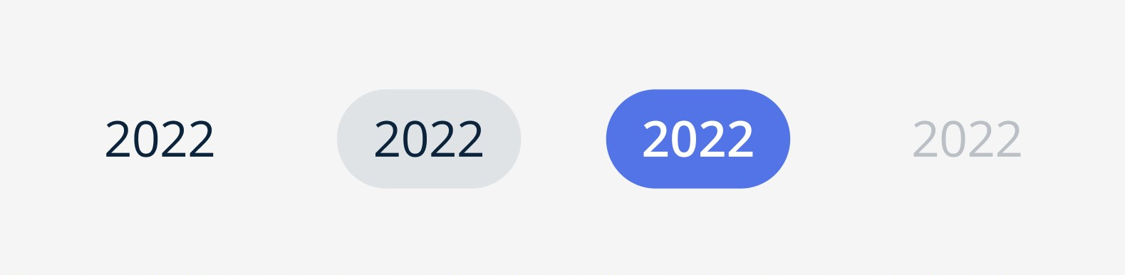
Year Control Text component variants

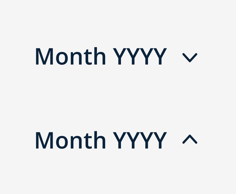
Year Range Text component
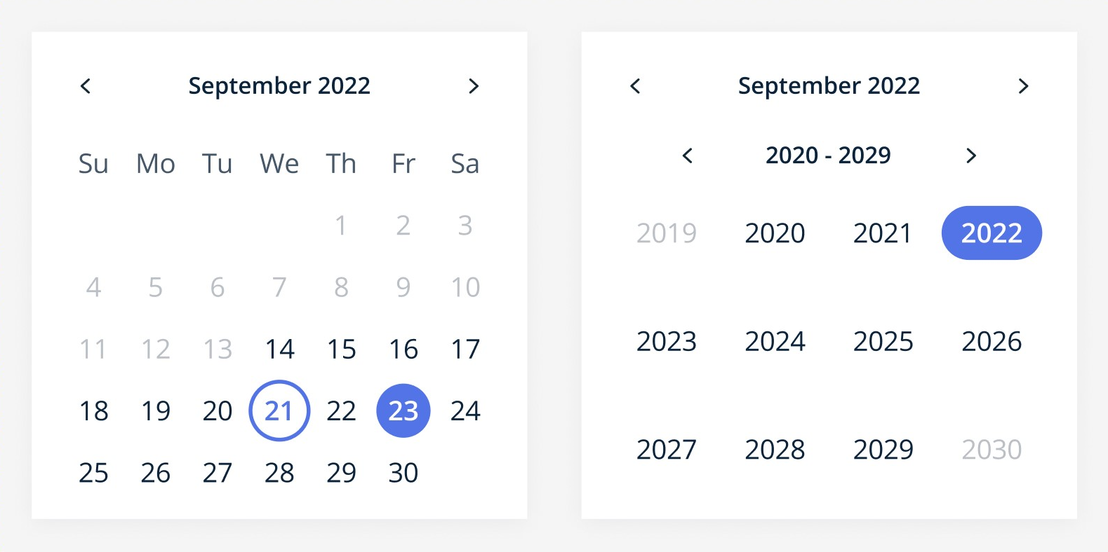
Calendar component variants
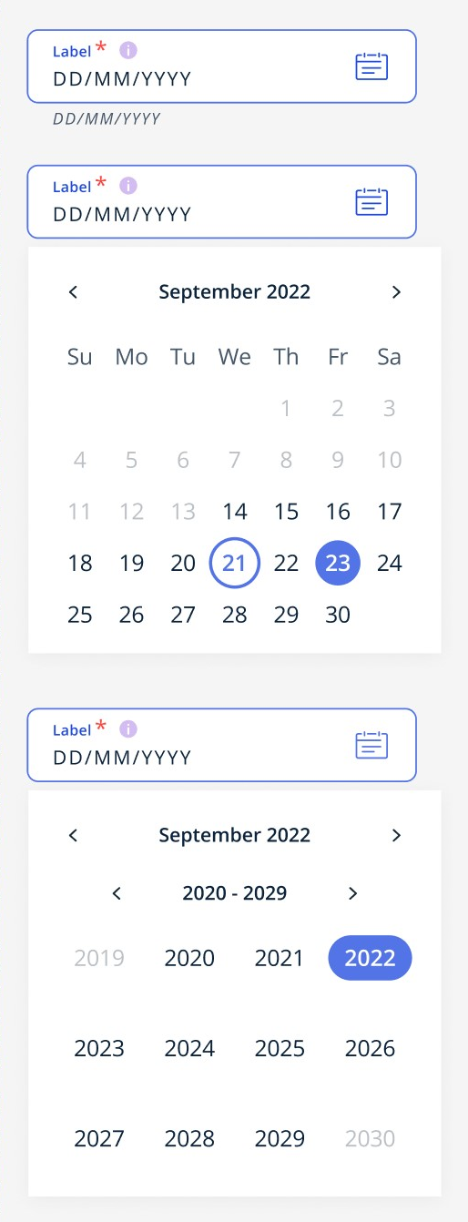
Single Date Calendar Picker example
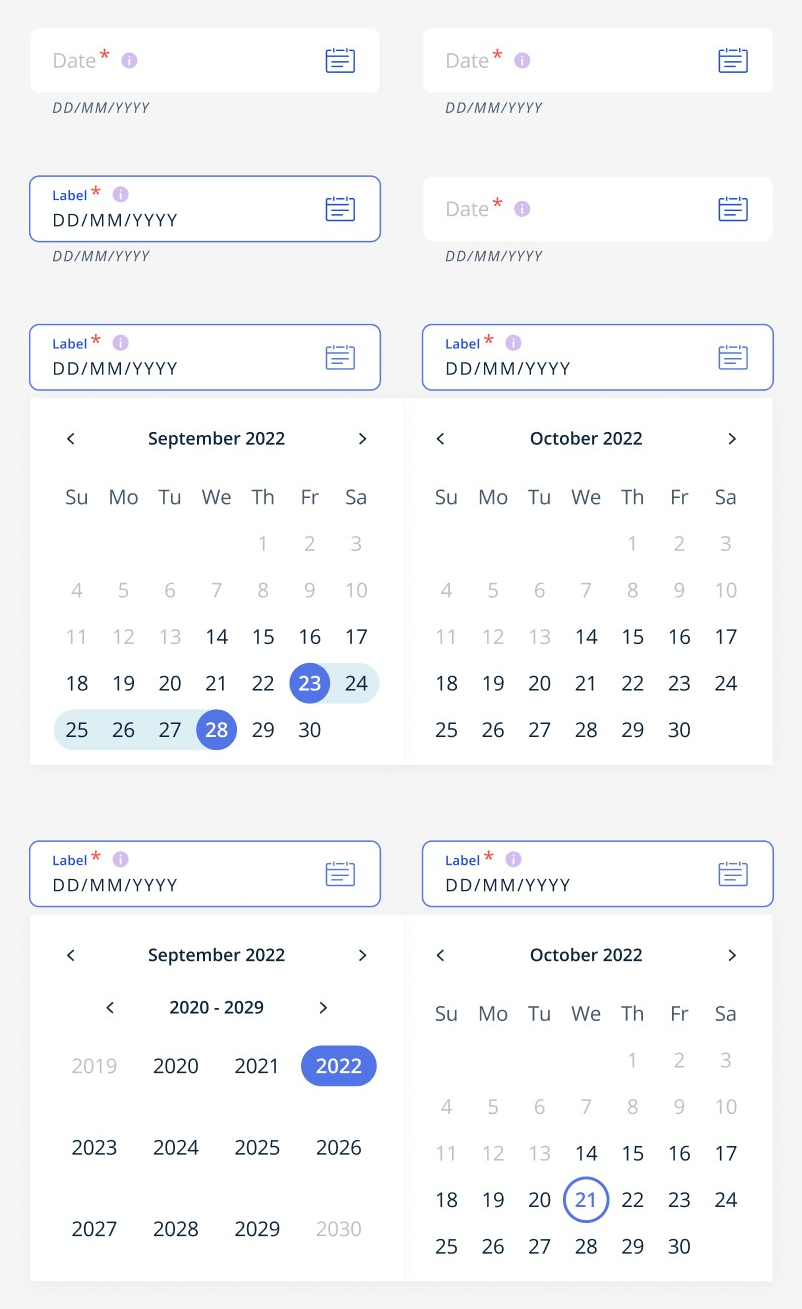
Date Range Calendar Picker example
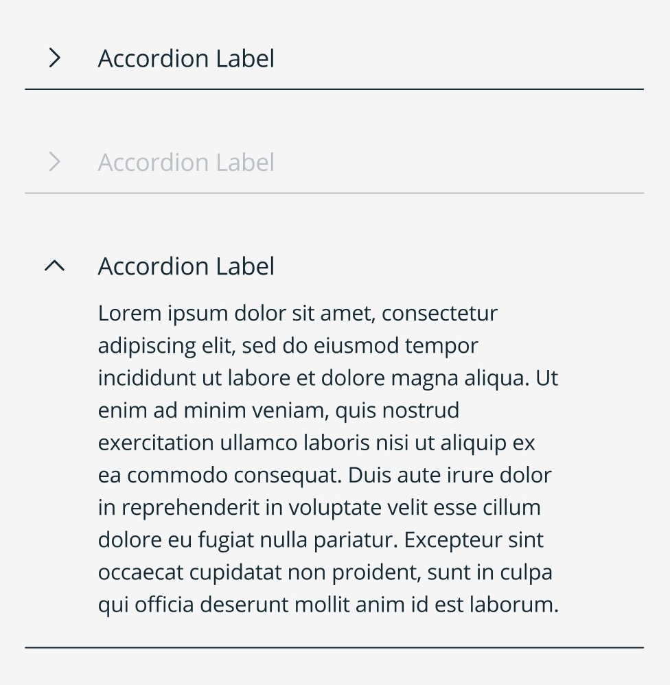
Accordion
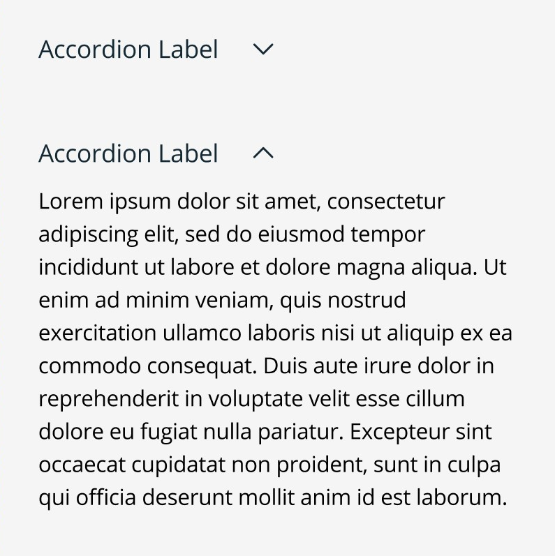
Single Accordion example
Stacked Accordion (Arrow) example

Stacked Accordion (Plus) example

Contained Accordion (Arrow) example

Contained Accordion (Plus) example
Filter

Filter Search Text component variants
Filter Options component variants
Filter Tag components
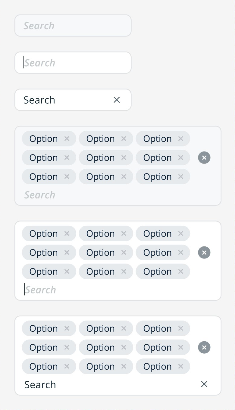
Filter Search Bar component variants
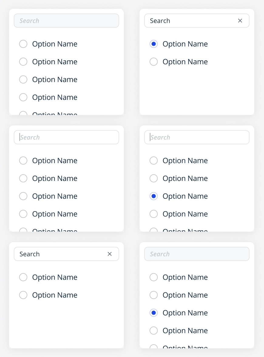
Single Category Single Selection Filter example

Multiselect Short Filter example

Multiselect Long Filter example
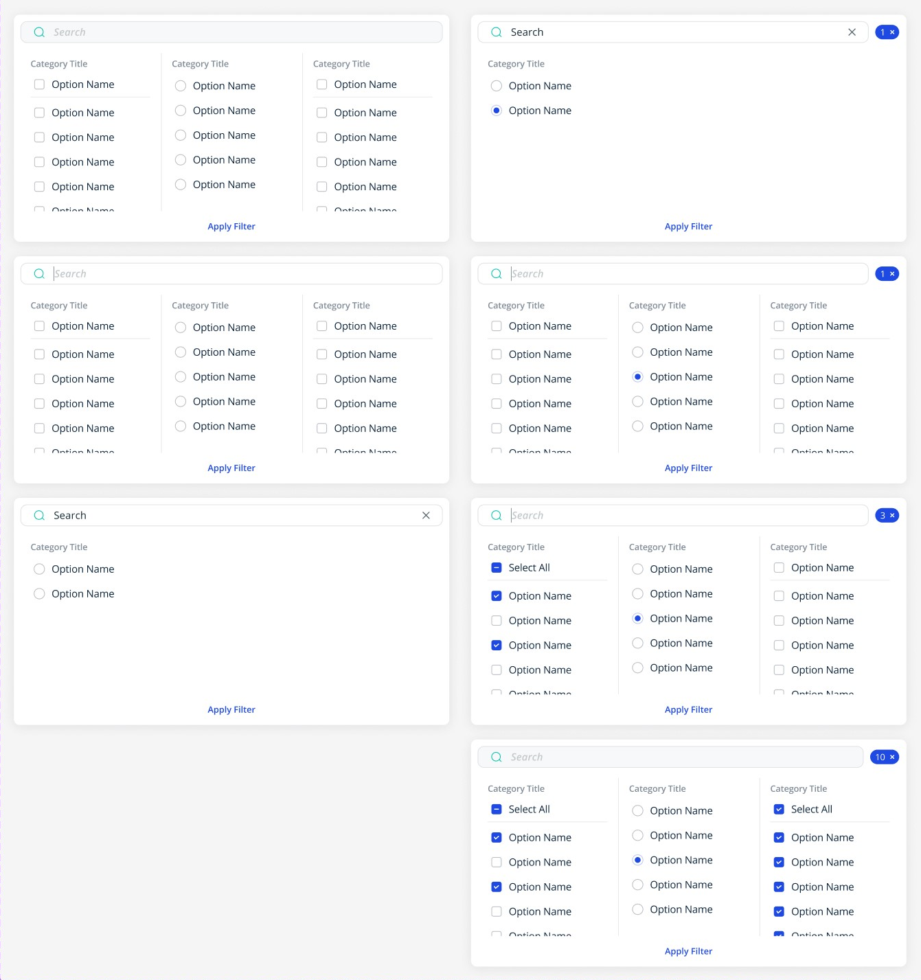
Multiple Category Filter example
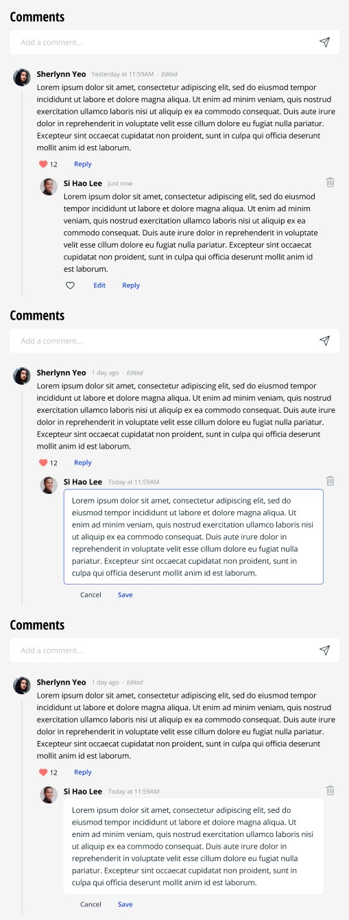
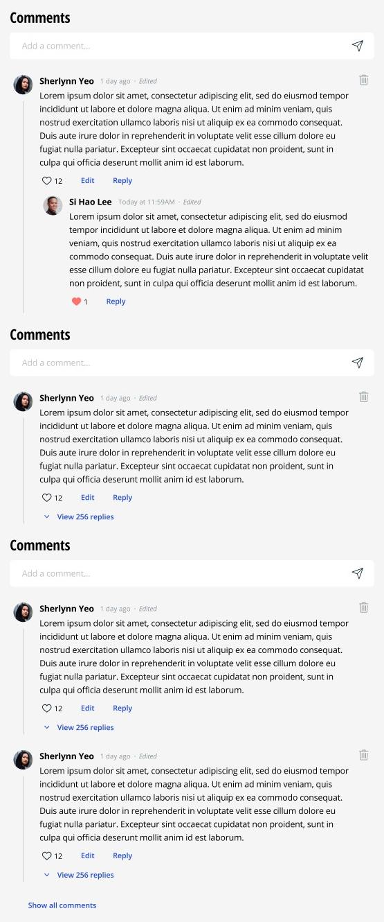
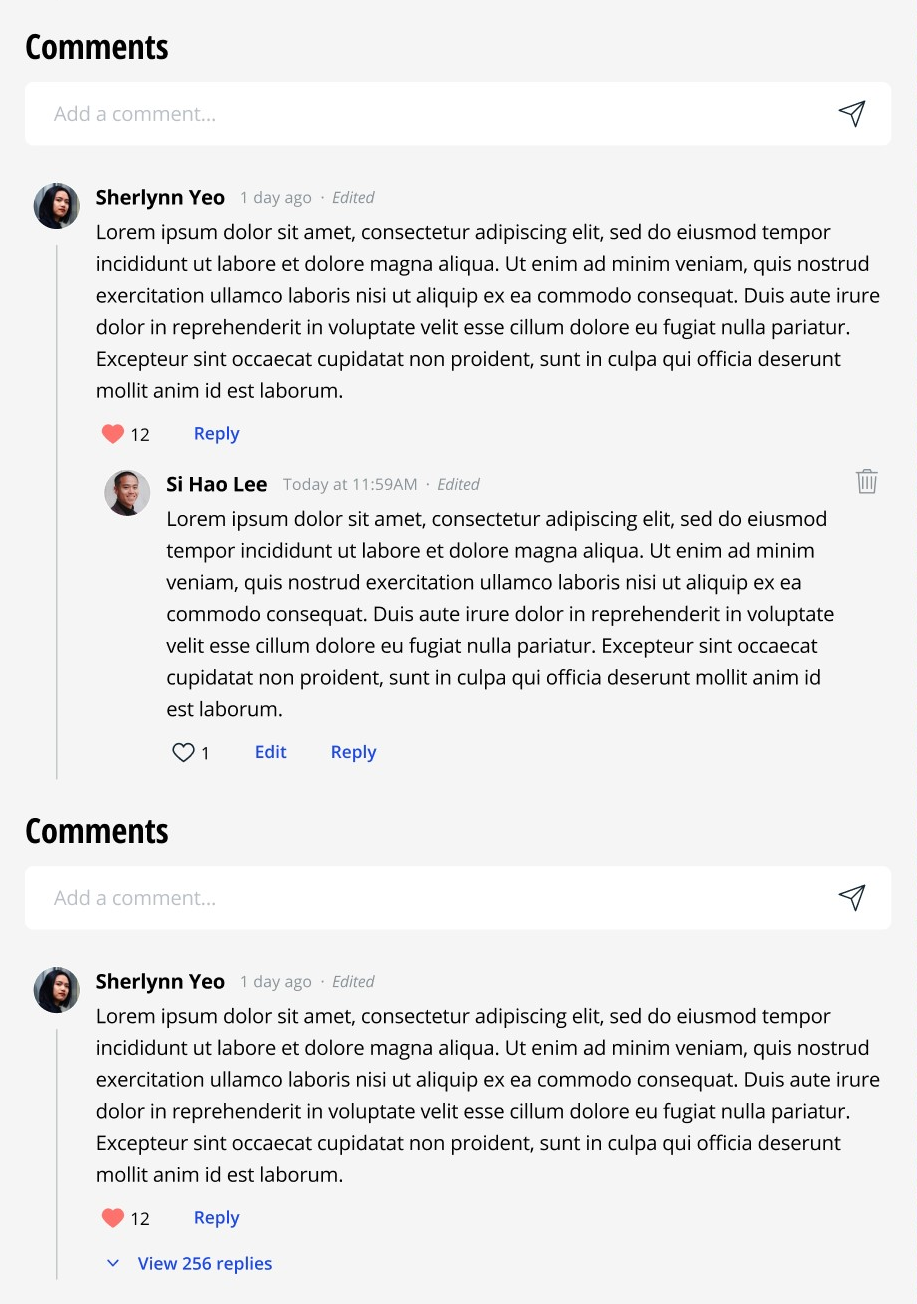
Comment
Comment Text Input Area component variants
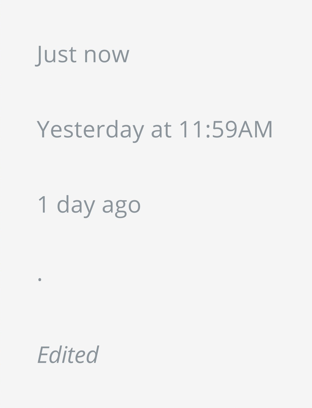
Comment Status component variants
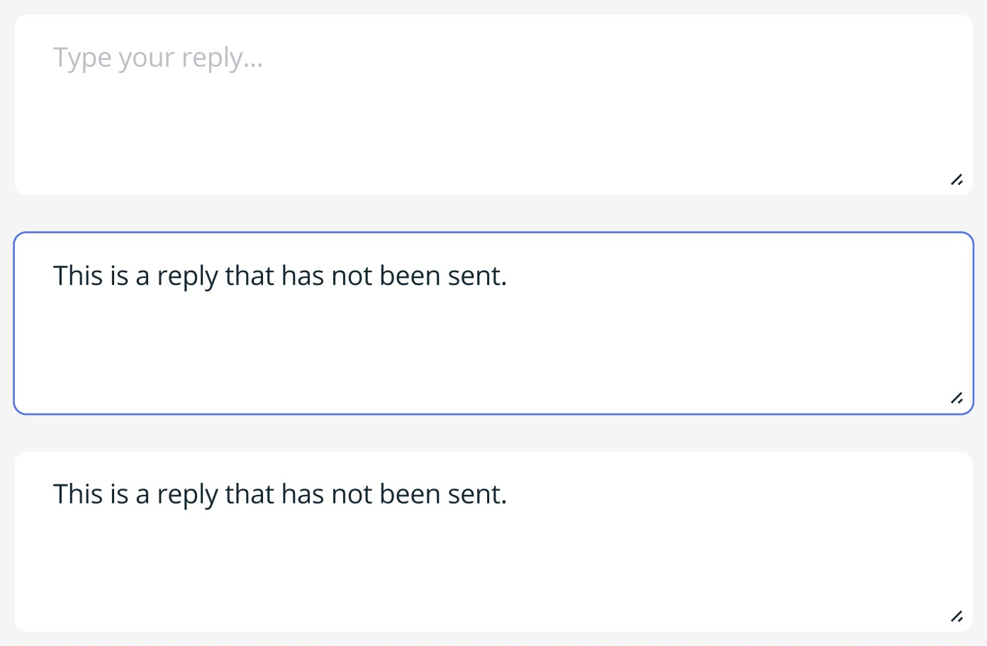
Reply Text Input Area component variants
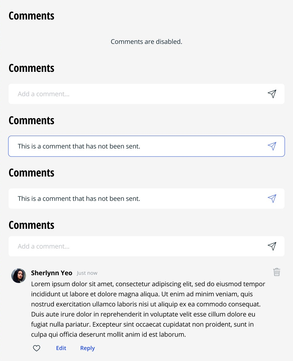
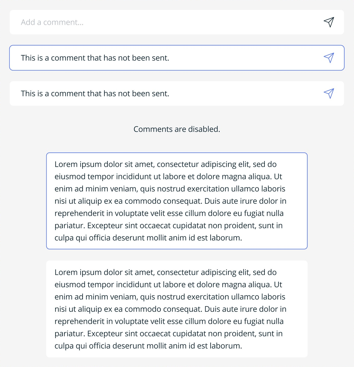
Comment Section example (Commentor's POV)
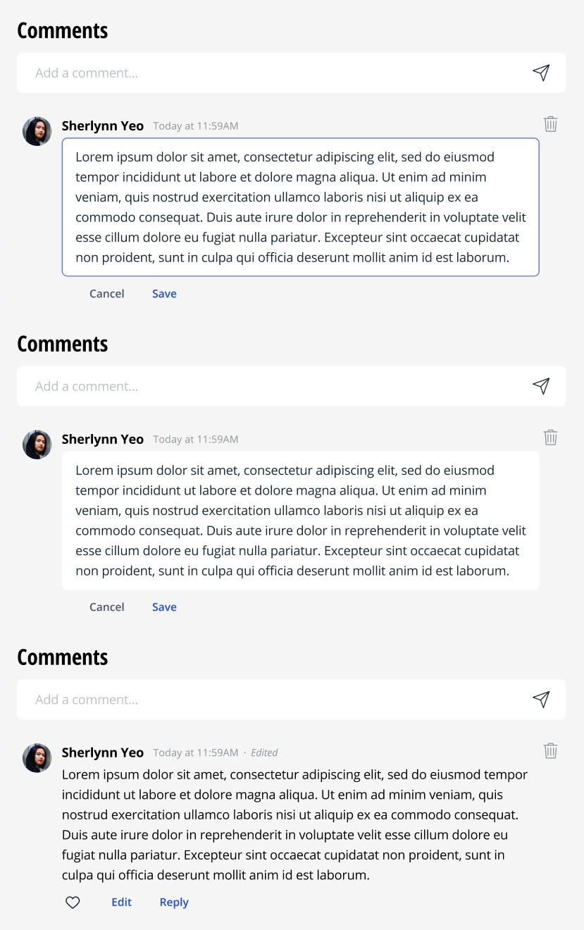
Comment Section example (Commentor's POV)
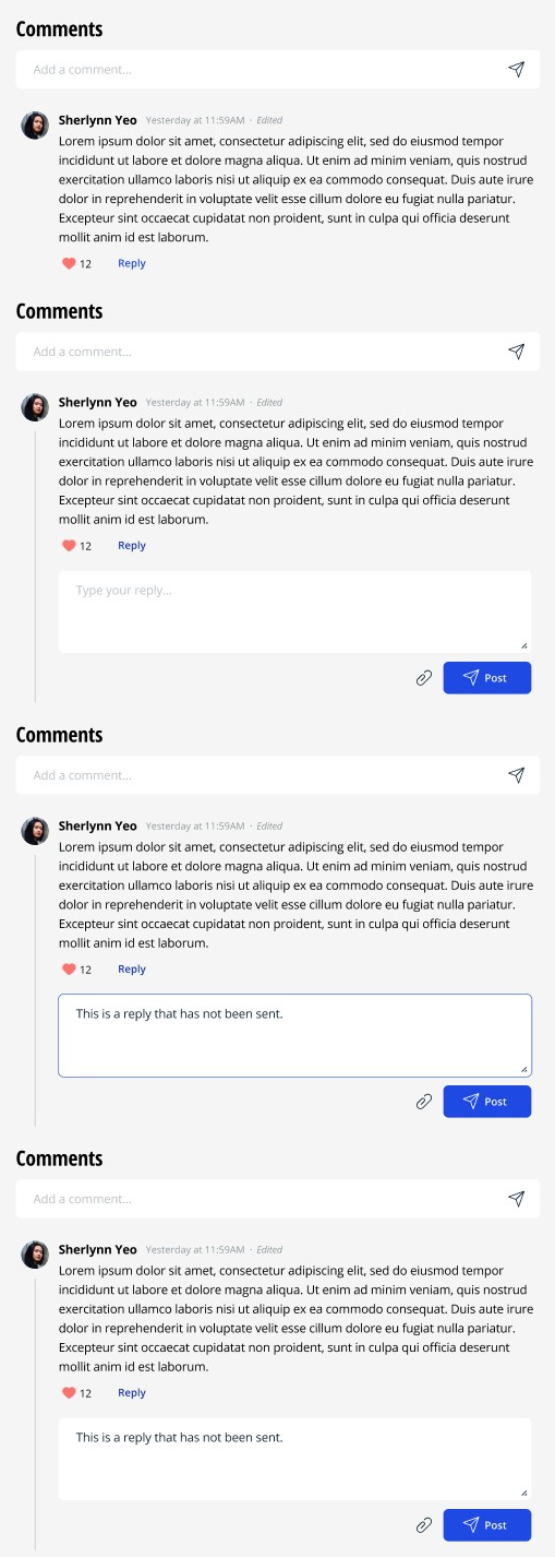
Comment Section example (Replier's POV)
Comment Section example (Replier's POV)
Comment Section example (Commentor's POV)


